

Every ecommerce entrepreneur knows that the foundation of your online store lies in its marketing efforts — and email is still one of the sector’s top marketing channels.
Email marketing is cheap, efficient, and flexible, and forms the backbone of pretty much every ecommerce strategy.
The average click-through rate of emails is 7.97%, but how do you make sure your emails are getting people to click? How do you create compelling and visually surprising emails that disrupt the usual inbox overload?
If your email marketing needs a bit of a refresh, why not learn from the best with these 6 beautiful ecommerce email examples....
Headspace

Image Really Good Emails
Mindfulness and serenity is the name of the game for meditation app Headspace, and nowhere is that more evident than in their welcome email to new customers. Light pastel colors and a sans-serif font make for a soothing sight in keeping with the brand’s mindful image. A single header makes for an uncluttered welcome, and a short paragraph outlining what the brand has to offer their new customer. Finally, a clear call-to-action rounds it all off nicely — and the CTA copy “Start Meditating” is a on-brand and compelling.
How to do it right
Simplicity is key when it comes to writing and designing your emails. Welcome emails in particular are vital when you’re reaching out to new customers. Too long and meandering, and your reader will lose attention and move on. Clear headings, concise sentences, and a good color palette will create an email that is visually pleasing, engaging, and one that your customers will actually want to read.
Taylor Stitch
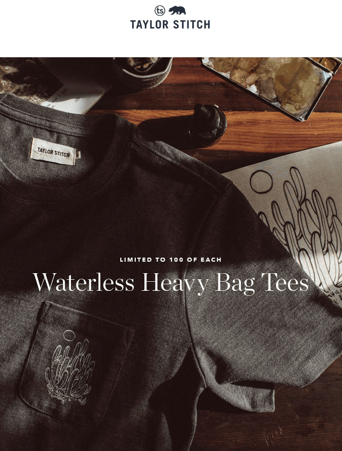
Image Really Good Emails
California-based menswear brand Taylor Stitch offer high-quality clothing for the discerning gentleman, but the eye for quality doesn’t end there. Their emails are always visually striking, and the above is a fine example of how they create a sense of luxury.
A single well-curated image grabs the reader’s attention immediately: a high-definition photograph in subdued tones that conveys the brand’s subtle sophistication. And a white text overlay draws the viewer to the key information, announcing their new product collection clearly.
How to do it right
Don’t clutter your emails with too many images. An overload of visual information will put off your readers. Instead, select one or two high-quality photos that show your product in a natural setting. If you’re a fashion ecommerce brand, take some snaps of your model styling your collection on a street or beach. Or if you’re a natural soap company, perhaps get some arty shots of your product surrounded by its ingredients? Even high-quality stock imagery will do — as long as you add your own twist with an overlay or CTA — a great hack for bootstrapping entrepreneurs. Learn the art of a good photo and keep it simple, and your emails will be sure to wow your audience.
GasBuddy
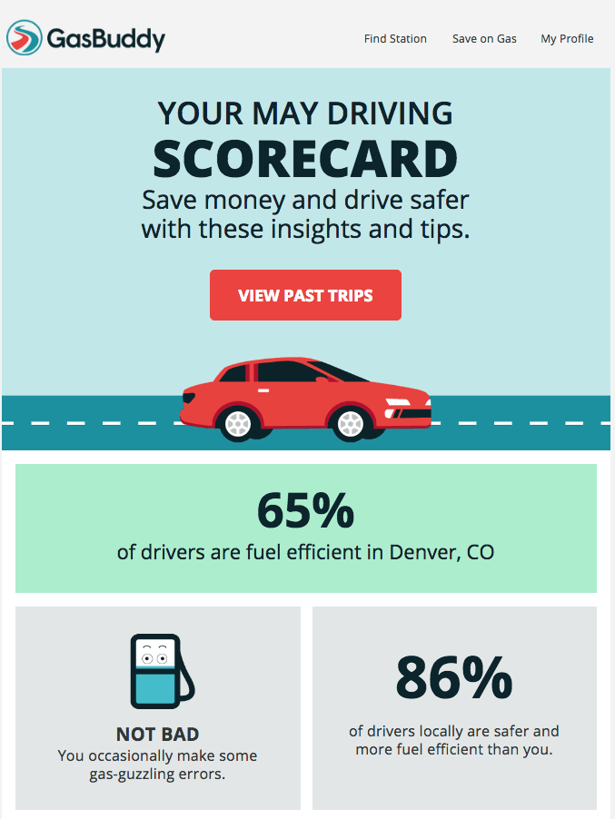
Image Really Good Emails
Big, bold, but simple, gas comparison site GasBuddy turns striking, concise emails into an art form. They know their customers — drivers who spend a lot of time on the road — don’t want to trawl through reams of copy to find out their driving stats. GasBuddy delivers the key information in bold text against light-colored backgrounds, instantly alerting the reader to the stats that matter most. Add to that an appealing call-to-action (who doesn’t want to save money?), and this is an email that will definitely get results.
How to do it right
Your customers don’t want to have to work to find the key information they need. Make it clear what your email is about by using bold headers and contrasting text/background colors. And there’s no need to include lots of text either. Use short and snappy sentences to draw the reader in, then include a CTA to lead them to a landing page with further information.
Harry’s
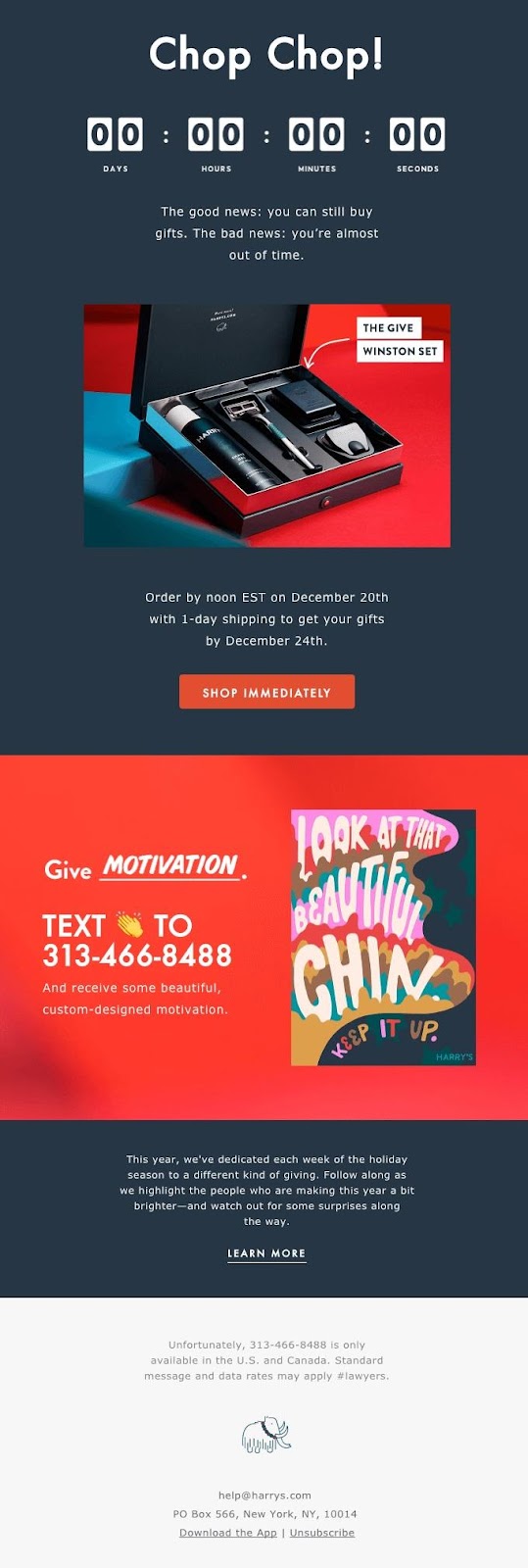
Image Really Good Emails
Mail-order shaving brand Harry’s uses contrasting text and background colors to draw attention to the ominous countdown timer that takes place front and center of their email. A timer is perfect for giving a consumer FOMO (fear of missing out) and compelling them to make a purchase before an offer or deal expires. An urgent CTA at the bottom of the email further pressures the reader into clicking through and really driving traffic to their landing page.
How to do it right
Successful ecommerce brands from all industries use deadlines as an effective way to drive up sales. Building a sense of urgency and pressure around a special offer drives your customers to purchase immediately. Add a free countdown script to your emails and watch your conversions soar. Just be sure to add a compelling call-to-action to lead your customers to your store.
Verizon
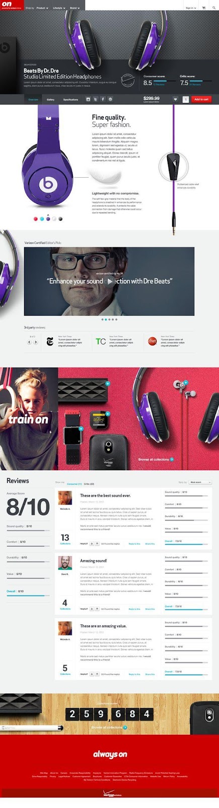
Image Really Good Emails
The marketers at telecommunications firm Verizon have done their homework. They use social proof to deliver genuine testimony from satisfied consumers straight to their customers’ inboxes. Accompanying the scores and reviews are photos of their happy customers, solidifying that social proof by giving a human face to their testimonial. All this is delivered in an easy-to-read grid with bold average scores and review titles,
How to do it right
Want to grow your ecommerce business and get in on the social proof act? Identify customers to your store who regularly buy one or more products. These are repeat shoppers who have a loyalty to your brand. The chances are that they’ll only be more than happy to provide an authentic testimonial for your store. Reach out to them and request a recommendation, and throw in a discount code or freebie to thank them for their time.
National Geographic
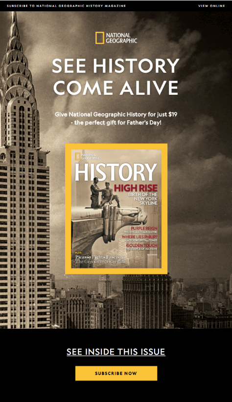
Image Really Good Emails
Naturally, an iconic brand like National Geographic should deliver iconic emails, and the above is no exception. A striking sepia photograph of the Chrysler Building and the New York skyline serves as a background which will resonate with the magazine’s typical readership. But what really makes this email dazzle is the use of National Geographic colors throughout. Blacks and yellows provide a visual brand message, and even the CTA itself is bold and visible in the instantly recognizable National Geographic colors.
How to do it right
Using brand colors in your email can help reinforce your brand identity in your marketing efforts. The color combination that you use serves as a subtle visual reminder to your customers in your emails. It also helps create a sense of visual continuity as they navigate from your emails to your landing page and beyond. Use a free color matcher to accurately capture your brand colors and use them in all your marketing communications or use a tool such as COLORRRS to quickly and easily convert from your logo.
When it comes to perfecting your email marketing, it’s always wise to learn from the best. Take some inspiration from the examples above and create beautiful emails that will dazzle your customers!

Patrick Foster is a writer and ecommerce growth hacker at Ecommerce Tips — an industry-leading ecommerce blog that offers practical marketing advice so your startup receives the exposure it deserves. Check out the latest posts on Twitter @myecommercetips.